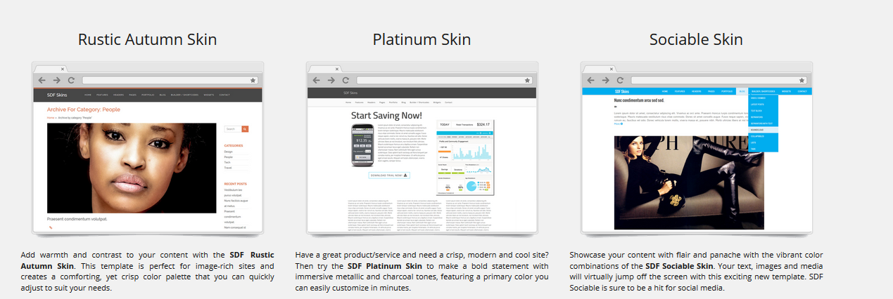
How to Create Your Own SDF Skin
 SDF Skins: Step-By-Step Instructions on How to Create Your Own Custom Skin.
To
Download the PDF Click Here. Otherwise, scroll below to view this tutorial.
If you'd like to create your own theme, here are the exact same steps we use in our protocol to make sure our designs are easy-to-use and pliable.
To Build Your Own SDF Skin:
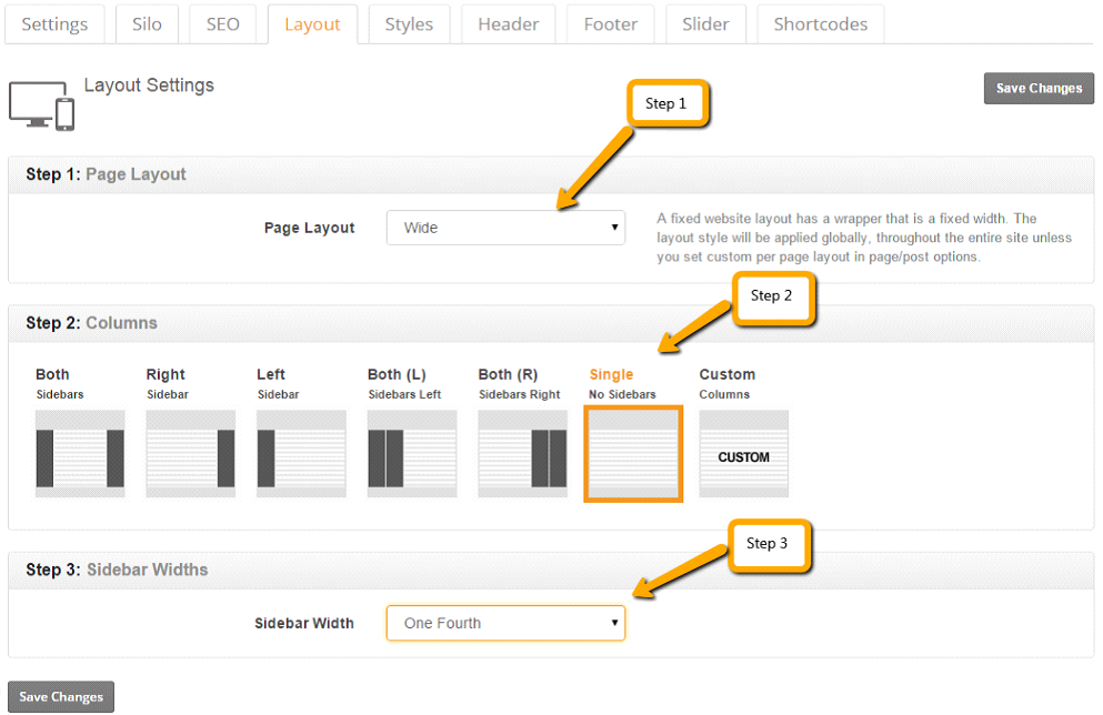
 First: Start with the layout settings under SEO Design
  Layout tab.
 In this section, we'll cover how to set up the layout for the skin.
In the layout tab you’ll have to perform the following three steps.
Step 1. Selecting Page Layout
Select the page layout from the dropdown options i.e. Wide or Boxed.
Step 2. Selecting Column Layout for Global Default Settings
Select columns from the given options according to your design requirements.
Step 3. Select the Sidebar Width
Select the Width of the sidebar from the dropdown menu for the Global Layout.
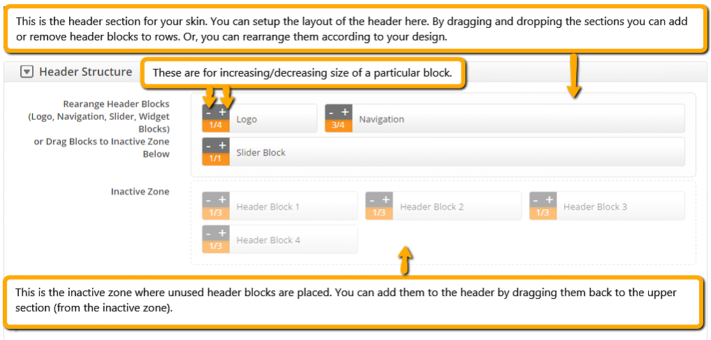
Second step: Now go to the header settings under the SEO Design Header tab Header Structure.
In this section, we'll cover how to set up the header for your skin.
In the header section you’ll have to perform the following 2 steps.
Step 1. Setting Header Structure
Here you can easily Rearrange the Header Blocks (Logo, Navigation, Slider or Widget Blocks).
You can also drag blocks to the inactive zone below or drag blocks from the inactive zone into the active section.
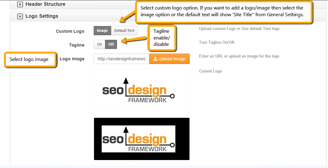
Step 2. Logo Settings
Under the Logo Settings chevron you can upload a custom logo or optional logo text and tagline.
Step 3. Additional HTML/CSS
In this section, you can add your additional CSS/Scripts/Html etc. to the header.
Third step: Next, go to the first tab called Global Settings under SEO Design Settings tab.
In this section, we'll cover how to set the Global Settings for the skin.
In the header section you’ll have to perform the following steps.
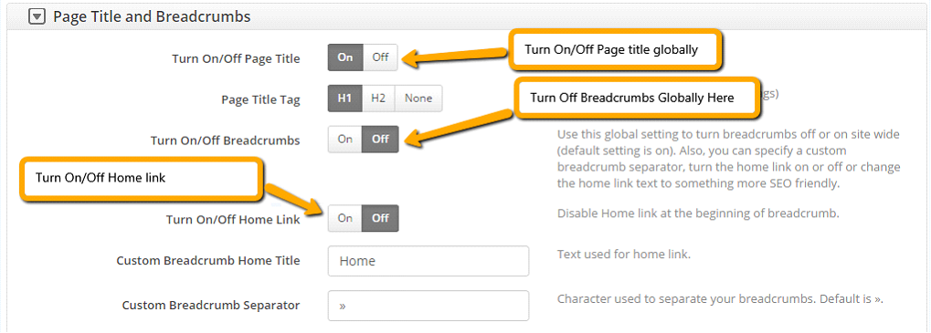
Step 1. Setting Page Title and Breadcrumbs
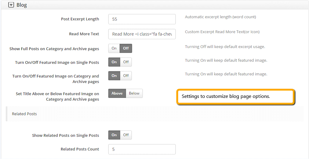
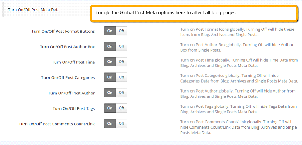
Step 2. Setting Blog page options
Step 3. Background Video
Under the background video section you can enable/disable background video (which appears on the local page settings).
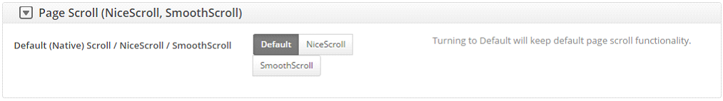
Step 4. Page Scroll (Nice Scroll, Smooth Scroll)
Under this section you can select page scroll options.
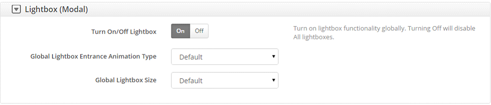
Step 5. Lightbox (Modal)
Under this section you can enable/disable lightbox, animation type and lightbox size
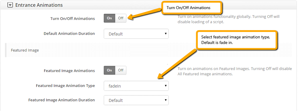
Step 6. Entrance Animations
Under this section you can turn on/off default entrance animations and featured images animation effects settings.
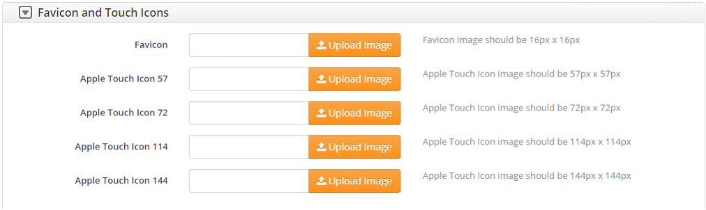
Step 7. Favicon and Touch Icons
Under this section you can upload your websites favicon.
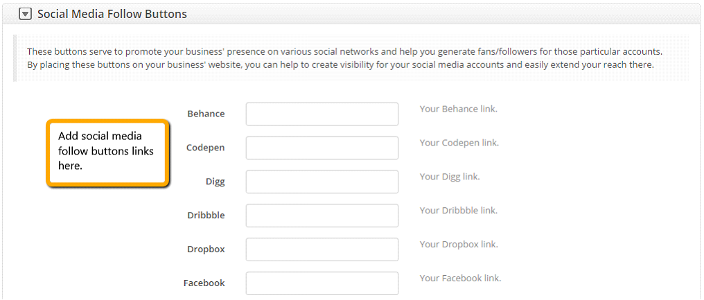
Step 7. Social Media Follow Buttons (Use widget to place them on pages).
Under this section you can add Social media follow button links to your social properties.
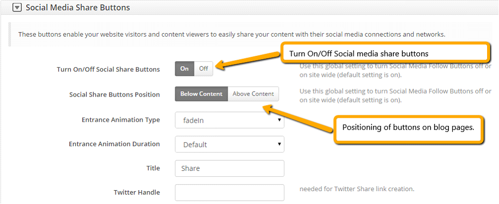
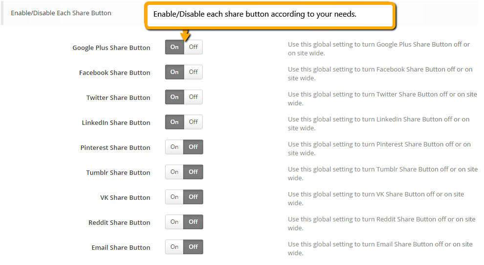
Step 9. Social Media Share Buttons
Under this section you can enable/disable all/each social media share button links and default positions.
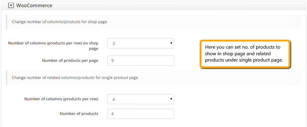
Step 10. WooCommerce
If you’re using WooCommerce then you can make changes to products, layout for shop page and related products.
Fourth step: Next step is to work on Style settings under SEO Design Styles tab.
In this section, we'll cover how to customize your styles settings for the skin.
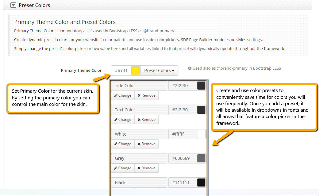
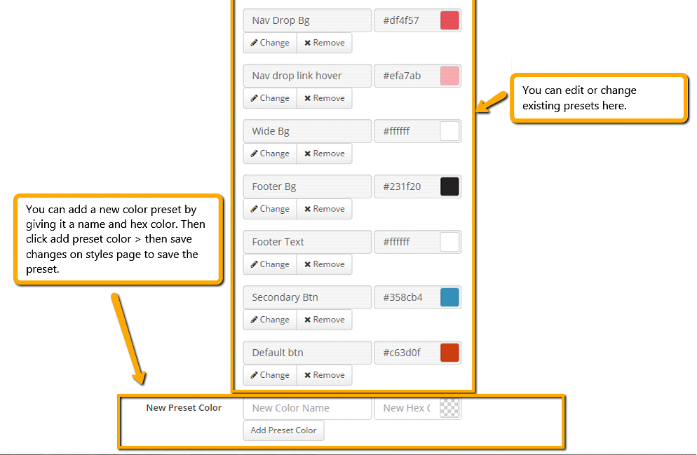
Step 1. Preset Colors
Define primary color and create essential color presets.
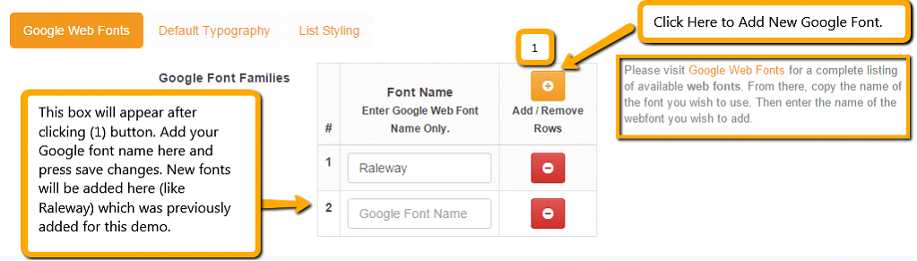
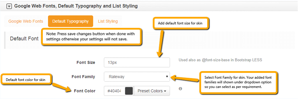
Step 2. Google Web Fonts, Default Typography and List Item Styling
Under this section we cover how to Install Google fonts, selecting default fonts and colors for the main content, H1-H6 styles, links and other essential font settings as required.
After adding google font family now you can select default typography tab for font style settings.
Note: Newly added font family will appear in this tab only if you save changes after adding font family in google web fonts tab. Also, you can add weight to fonts e.g. Raleway:500, Raleway:600, etc. to make it thicker. 400 weight is default and you can customize from 100-800 weight. So, just use Font:700 as an example to get the 700 weight for that font. All changes will appear in the dropdown in all font options in the framework once saved.
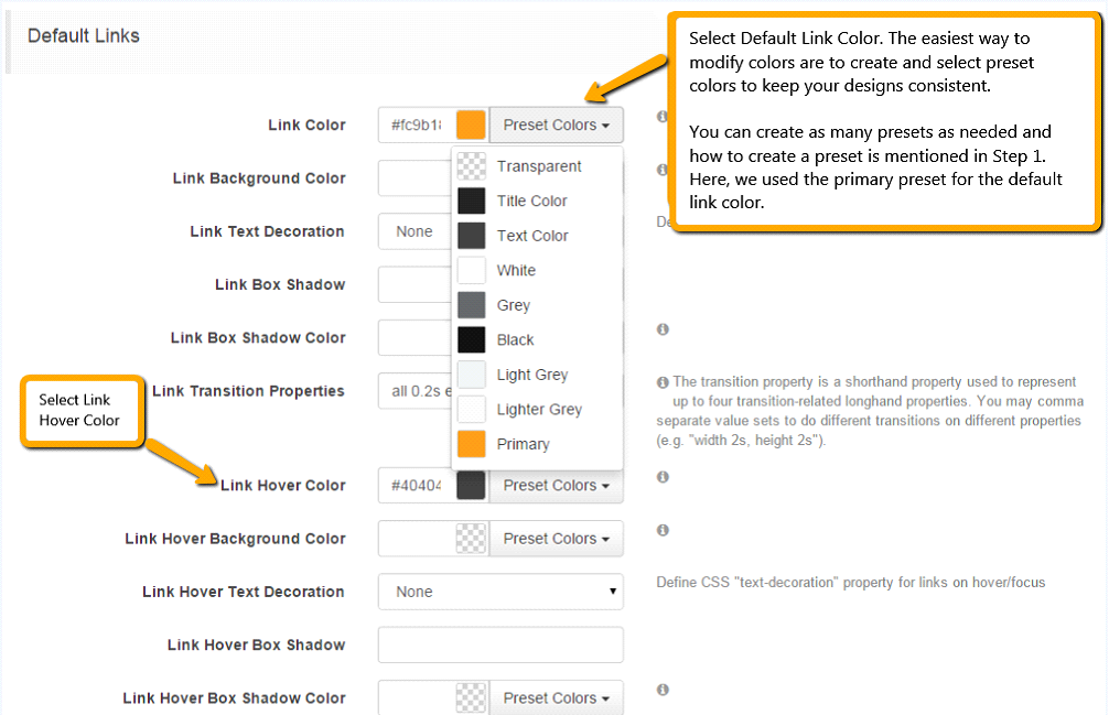
Next you need to set default links styles:
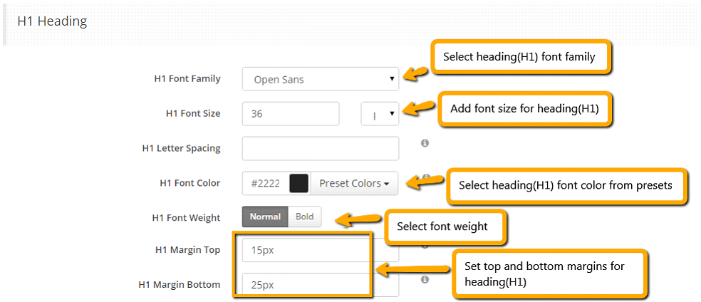
Set preferred font settings for Headings i.e. (H1-H6)
Here are the settings for headings (H1-H6). You can customize your headings based on your preferences. Also, we’ve included top and bottom margins for headings so when added to content, there is consistency for top and bottom margins automatically, rather than you having to set them manually at the page level.
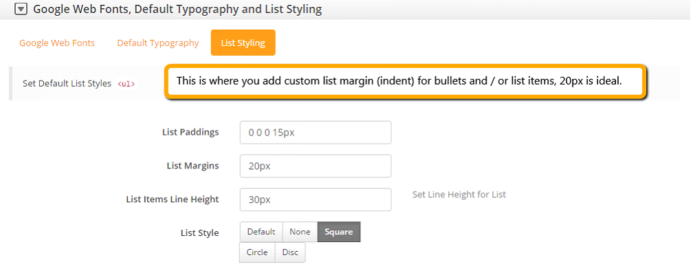
Set list styling under last tab of this section:
Default list styling:
Set the list style to circle or square (so when you add list items in content, they show up styled).
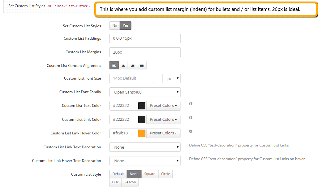
Custom list styling:
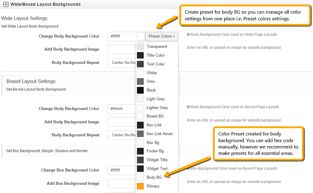
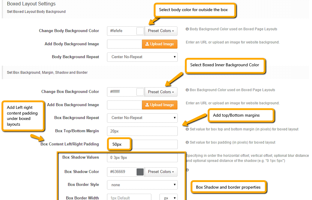
Step 3. Wide/Boxed Layout Options
Under this section we cover how to add wide or boxed layouts.
Note: You can add body background image in both wide and boxed backgrounds.
For wide layouts:
For boxed layout:
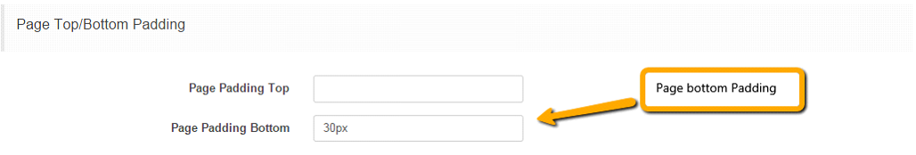
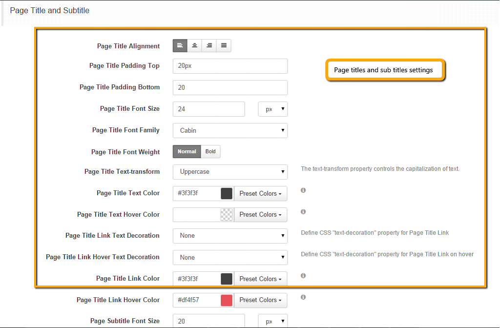
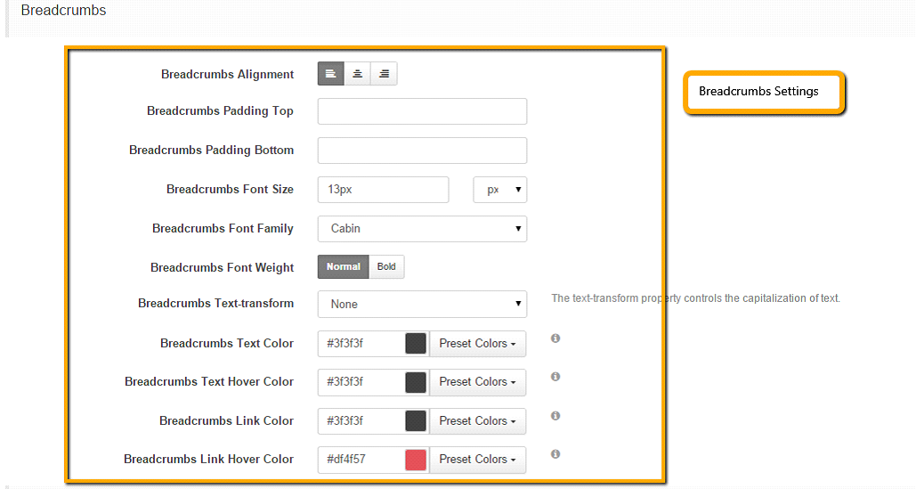
Step 3. Page Padding, Page Titles and Breadcrumbs
Under this section we’ll cover:
1. Page Top/Bottom padding
Add padding to the top or bottom of the page layout globally. Please use px, em or pt as a suffix to digits.
2. Page Title and Subtitle
3. Breadcrumbs Settings
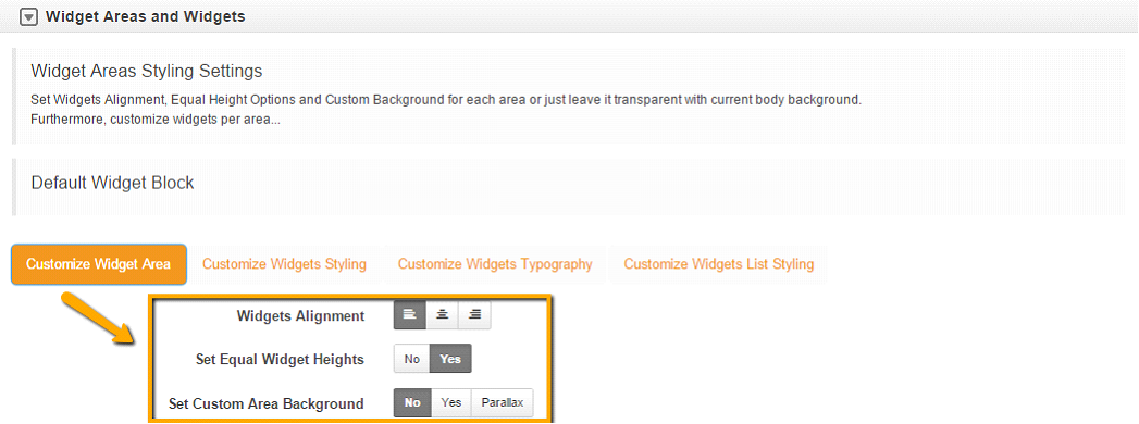
Step 4. Widget Areas and Widgets
Under this section we’ll cover:
-
Widget area style settings
-
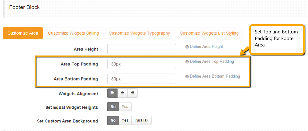
Set widgets alignment, equal height options and custom background for each area or just leave it transparent with current body background.
Furthermore you can customize widgets per area...
Such as the: Default widget block. You can customize settings for the Right Sidebar, Left Sidebar, Above Content Block or Below Content Block according to your needs. If you don’t set custom settings for each widget area, they will inherit settings from Default Widget Block.
1. Customize Widget Area
2. Customize Widgets Styling (leave widget background set to no unless you need a specific background customization select yes and additional options will appear).
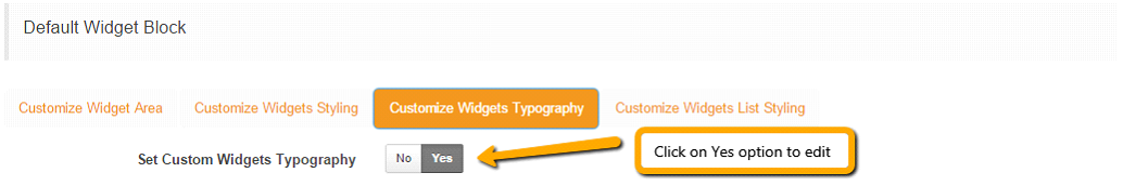
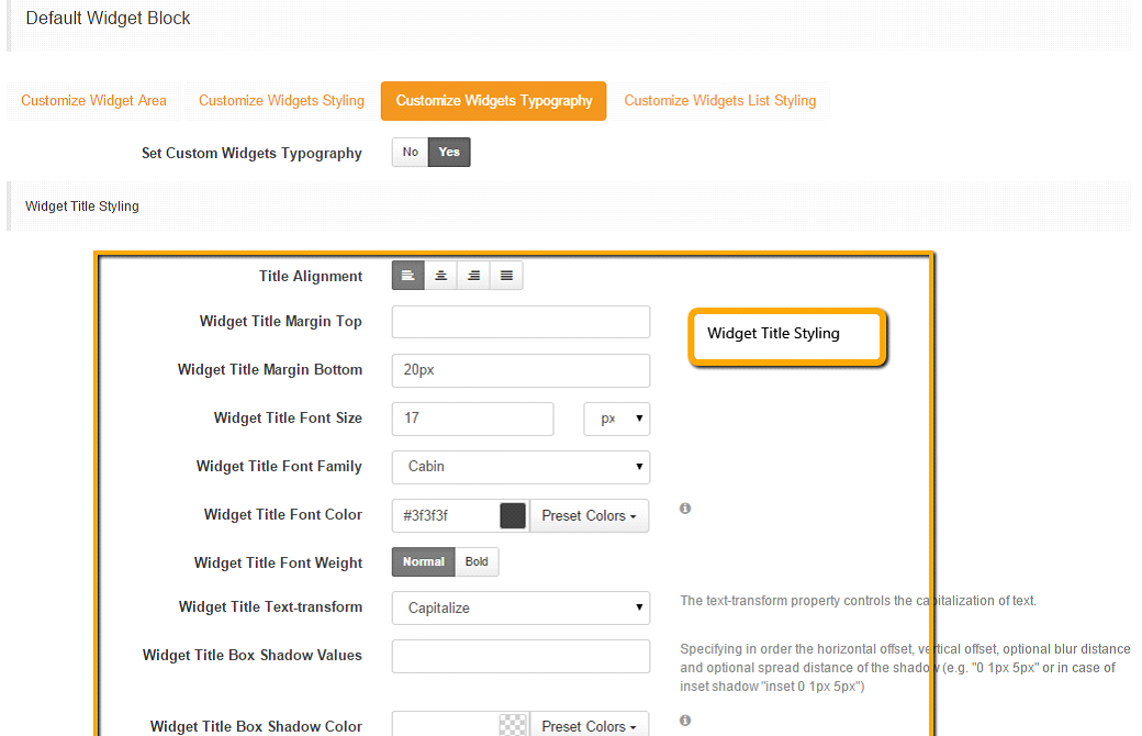
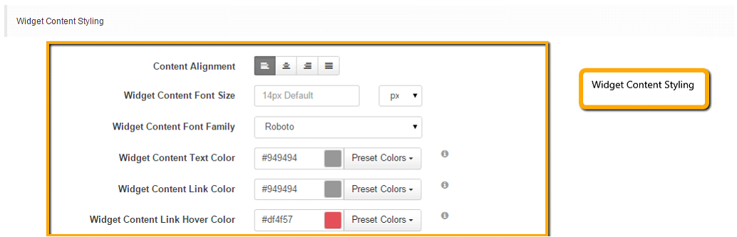
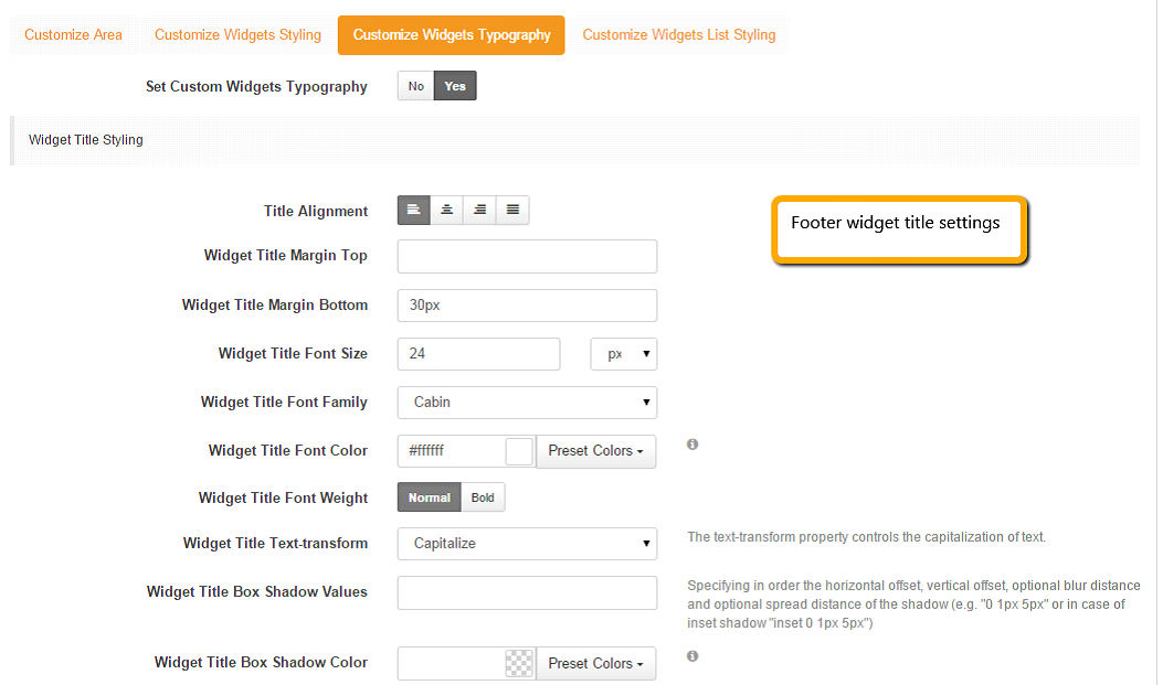
3. Customize Widgets Typography
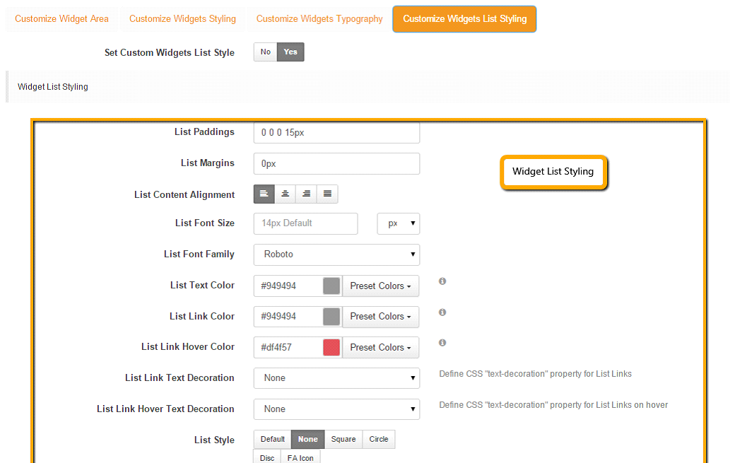
1. Customize widget list styling
Step 5. Header settings
Under this section the Header settings include:
Default header font settings
Default header link settings
Header Block 1, 2, 3 and 4 settings. Also note that Header Block Settings are similar to Widget settings which as demonstrated above.
Note: These settings are mandatory only require customization if you are trying to create some specific layout for the header blocks.
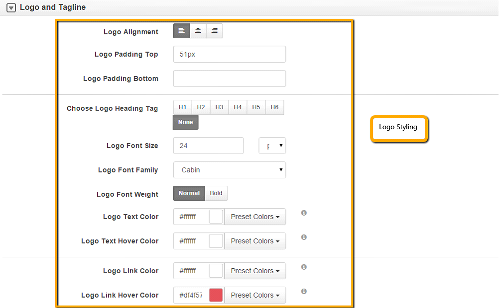
Step 6. Logo and Tagline
Under this section we demonstrate how to customize logo and tagline styles.
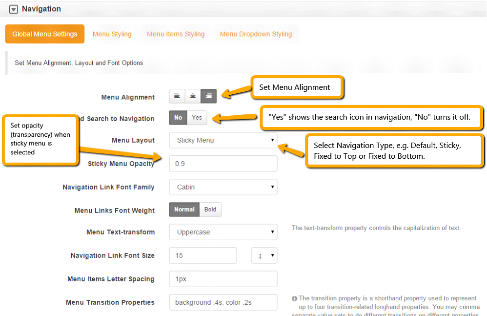
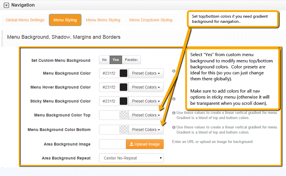
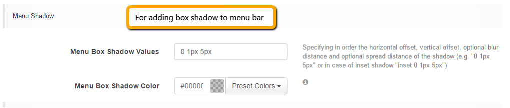
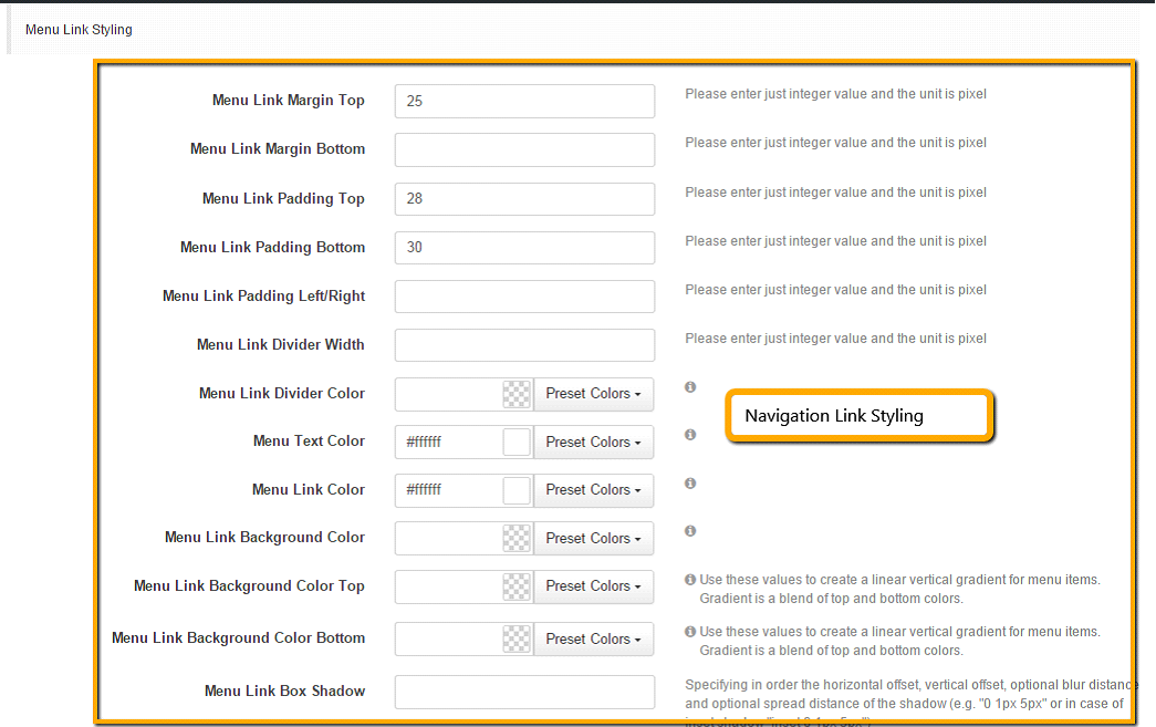
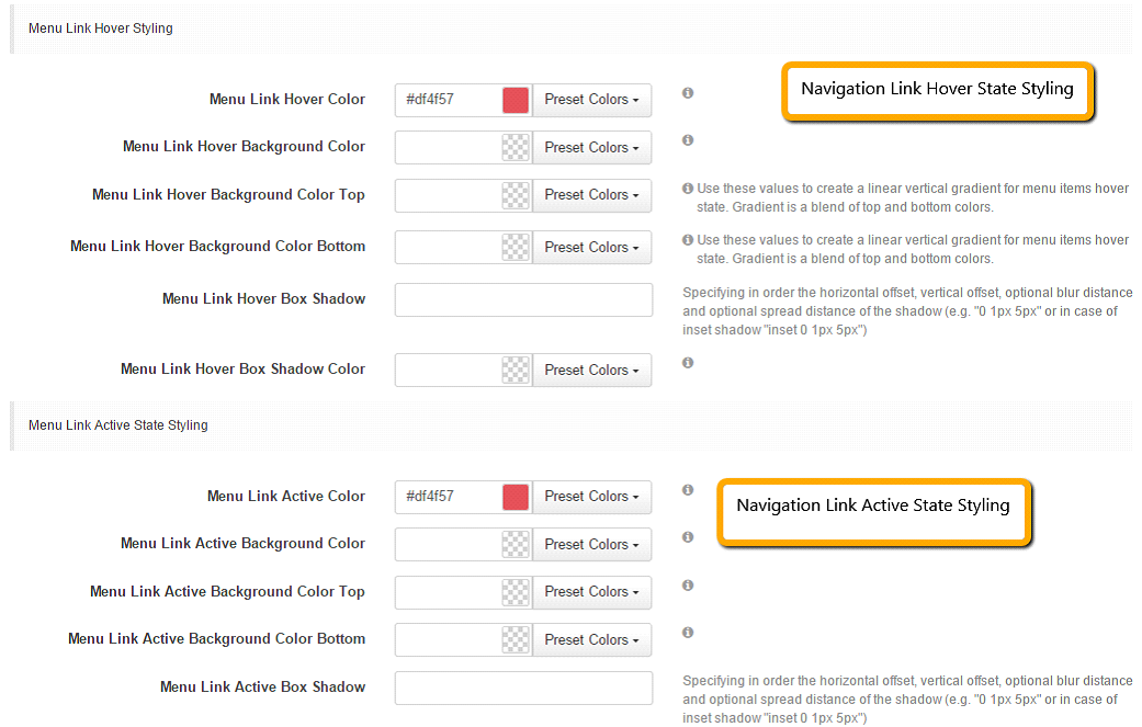
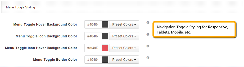
Step 7. Navigation
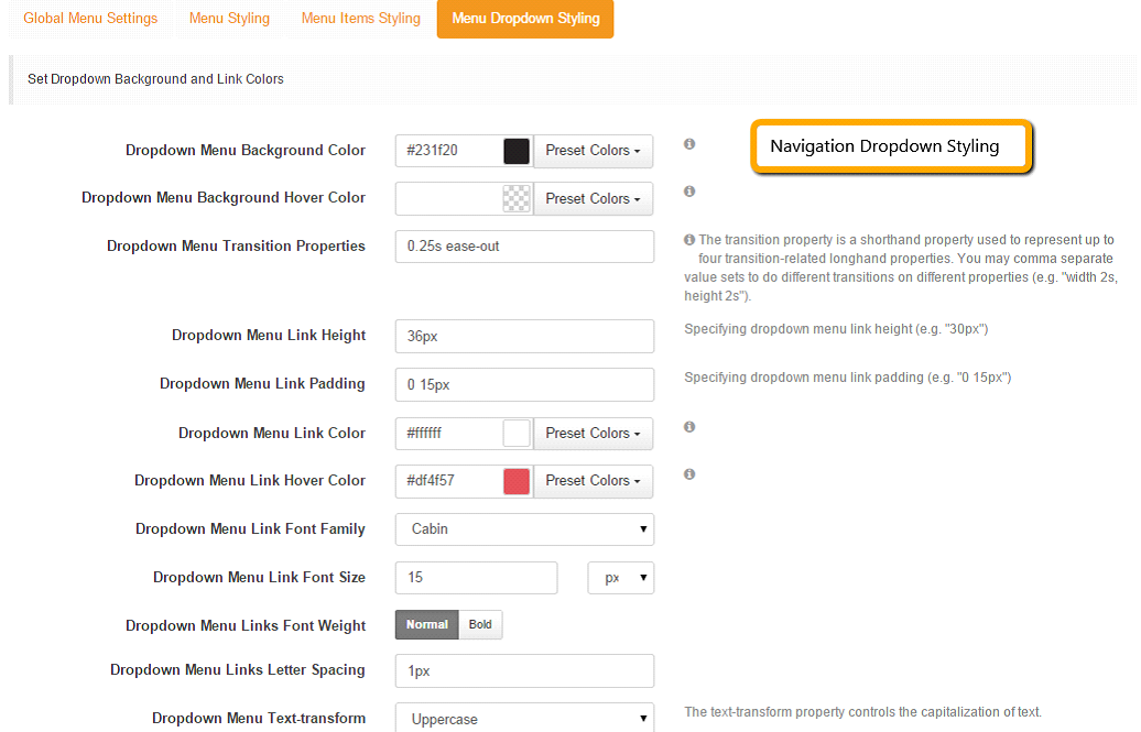
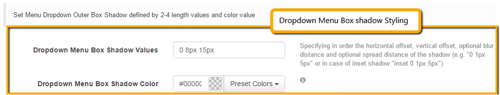
Under this section we demonstrate about how to customize Navigation and Dropdown Navigation Styling.
1. Global Menu Settings
2. Menu Styling
1. Menu Item Styling
2. Menu Dropdown Styling
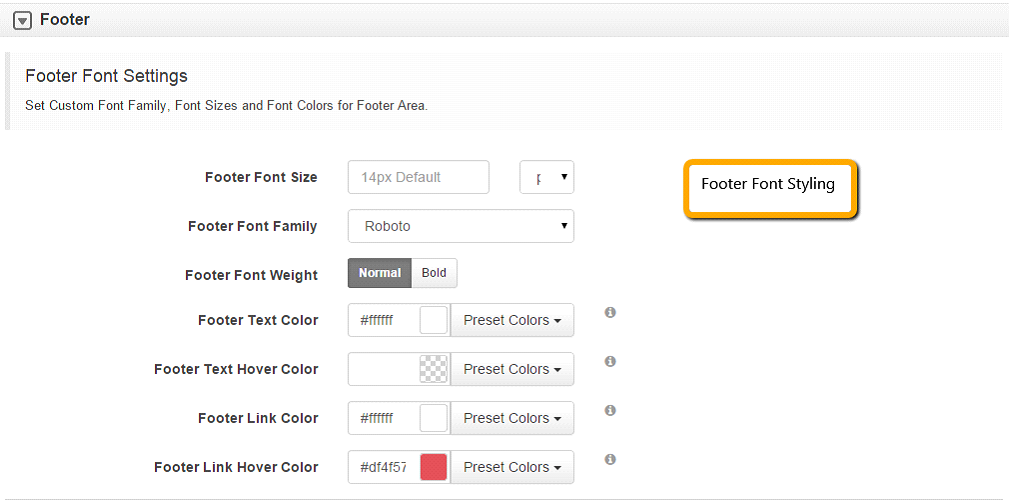
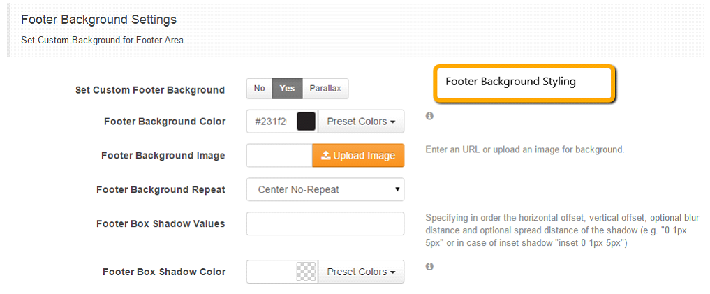
Step 8. Footer
Under this section we demonstrate how to customize top and bottom footer blocks and their respective style/settings.
1. Footer font Settings
2. Footer Background Settings
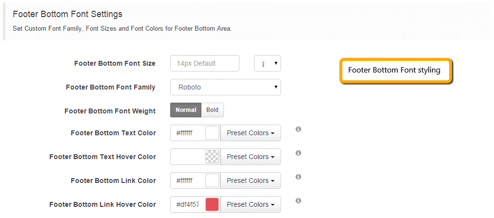
3. Footer Bottom Font Settings
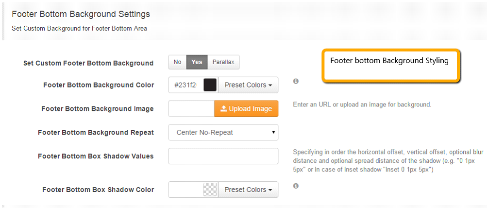
4. Footer Bottom Background Settings
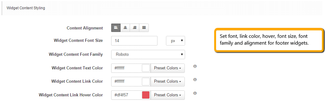
5. Footer Block Settings (footer widget settings).
1. Footer Font Settings
2. Footer Font Settings
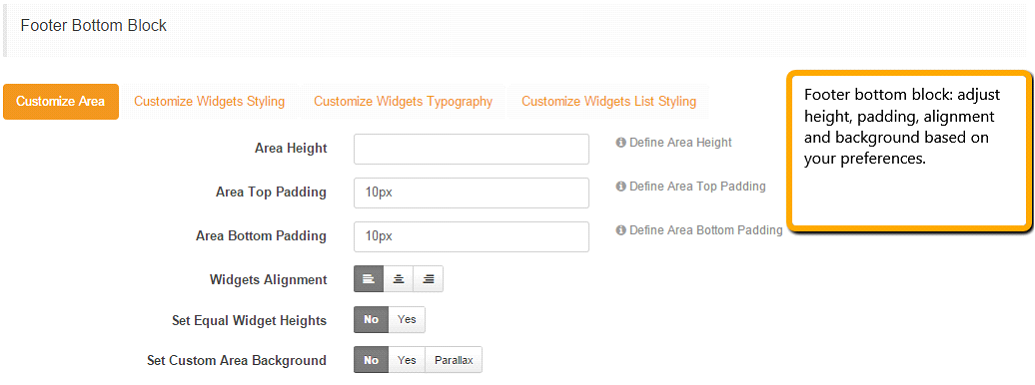
3. Footer Bottom Block
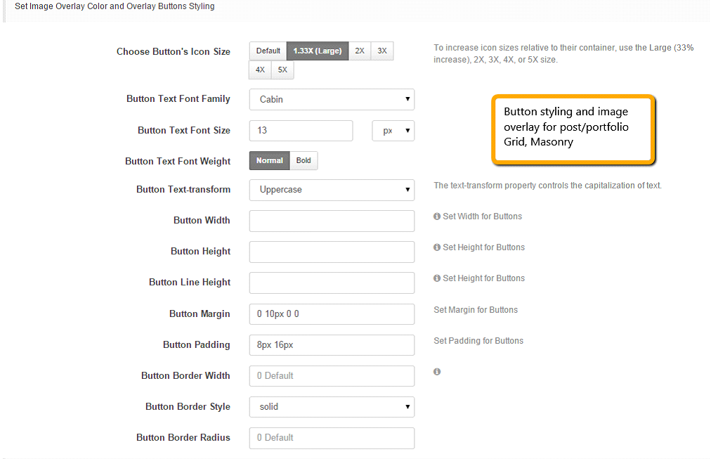
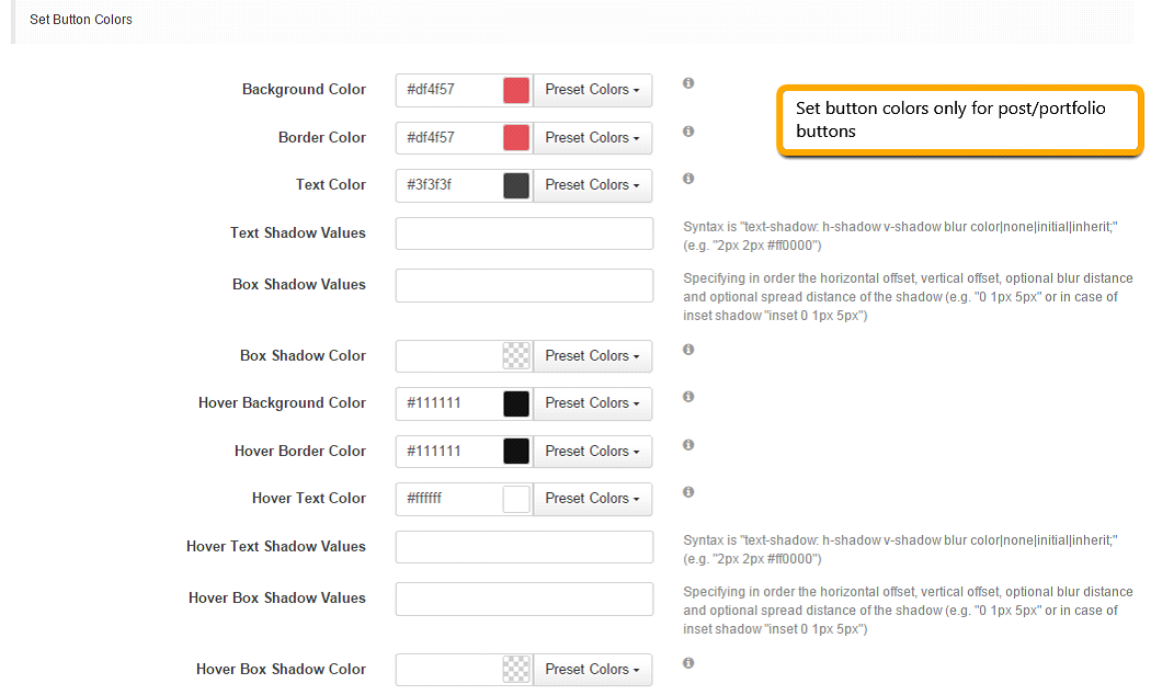
Step 9. Posts/Portfolio Grid Images and Image Overlay Styling
Under this section we’ll cover how to customize Posts/Portfolio Grid Images and Image Overlay Styling.
1. Set Image Overlay Color and Overlay Button Styling
2. Set Button Colors
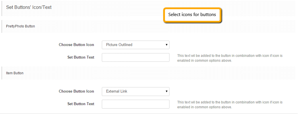
3. Set Buttons Icon/Text
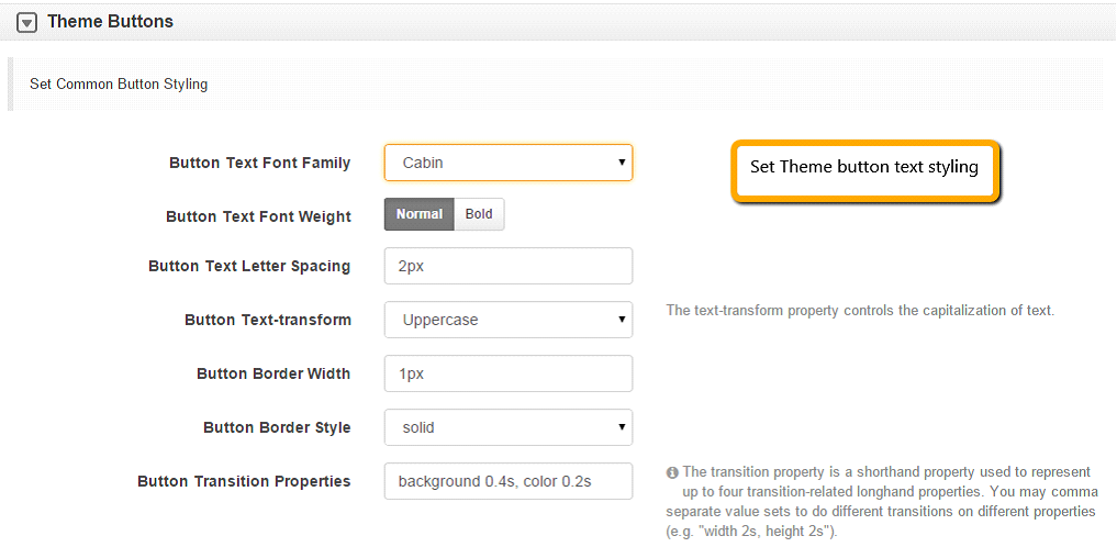
Step 10. Theme Buttons Settings
Under this section we’ll cover how to style your theme’s buttons:
1. Set Common Button styling
1. Set Buttons Background, Box Shadow and Text Colors
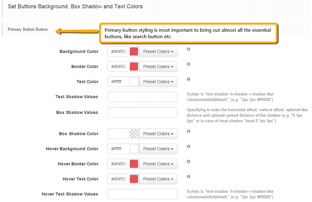 Similarly like Primary button settings, you’ll need to customize your:
Make sure you set different colors for secondary and default buttons from primary button color.
If you don’t customize the button colors, they will fetch from color schemes from the default bootstrap color variables which you can see here.
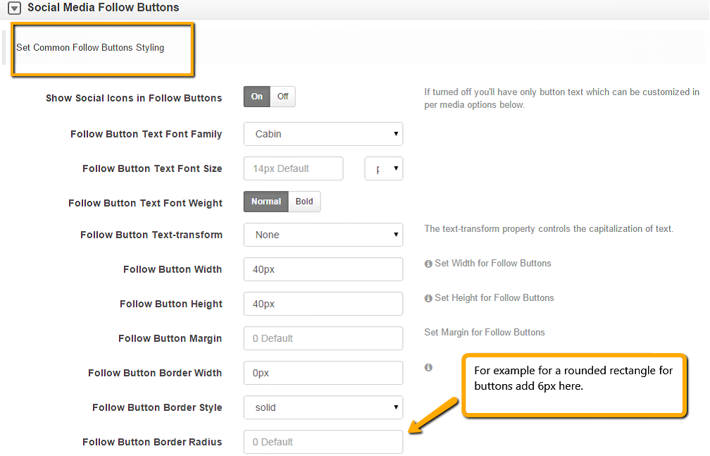
Step 11. Social Media Follow Buttons
Under this section we cover how to style social media follow buttons:
1. Set Common Follow Buttons Styling
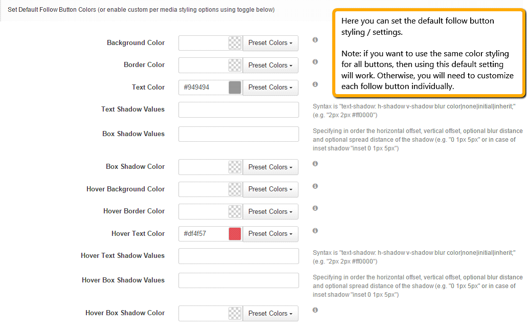
2. Set Default Follow Button Colors (or enable custom per media styling options using toggle below).
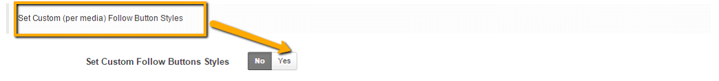
3. Set Custom (per media) Follow Button Styles
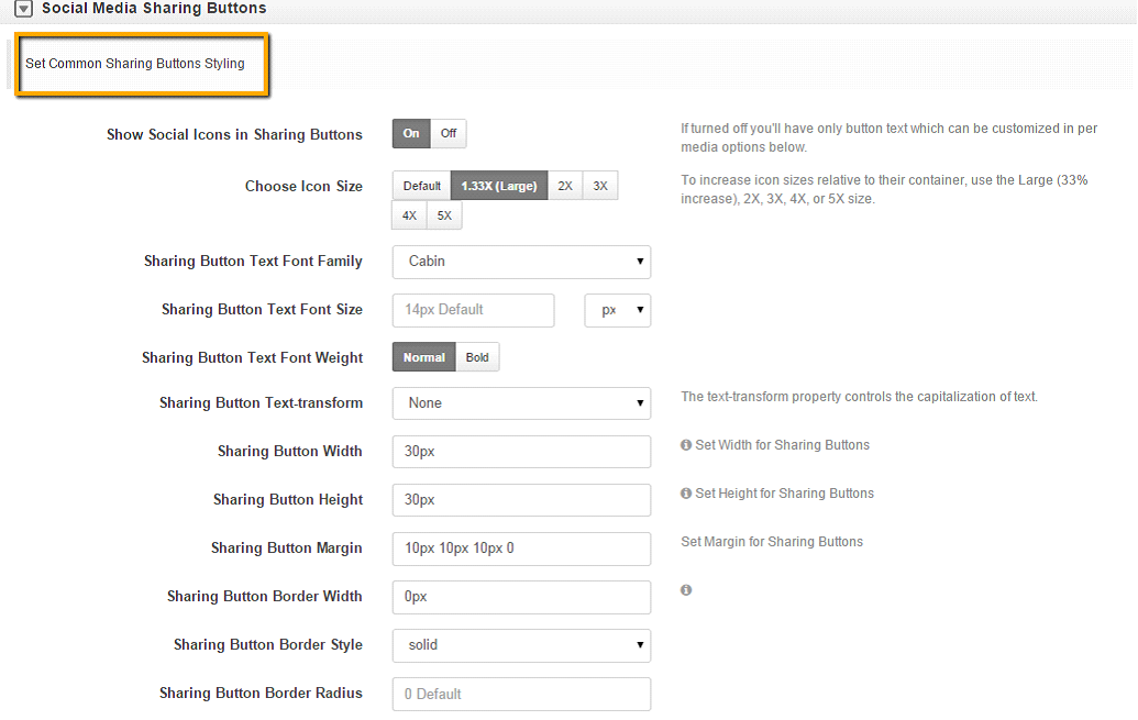
Step 12. Social Media Share Buttons
Under this section we cover how to style social media share buttons:
Note: Enable (Yes) to show social icons for sharing buttons. If not enabled they will not show.
Customize as desired.
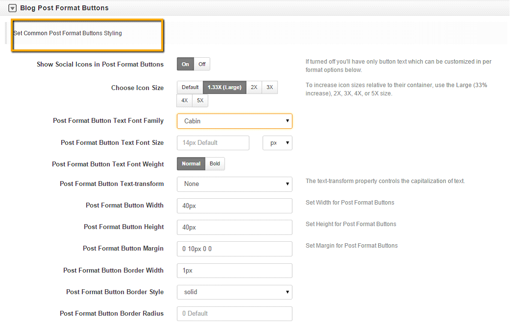
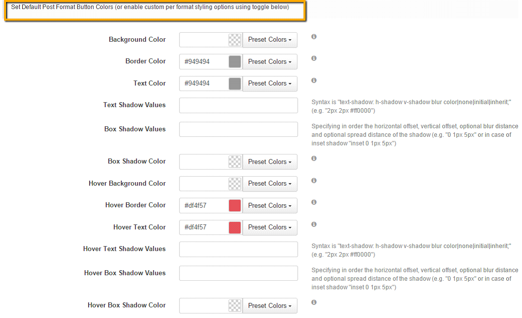
Step 13. Blog Post Format Buttons
Under this section we’ll cover how to style the Blog Post format colors:
1. Set Common Post Format Buttons Styling
2. Set Common Post Format Buttons Styling
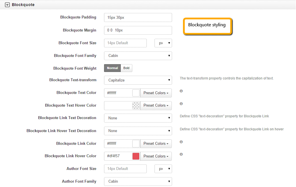
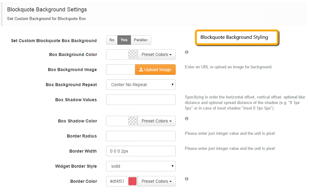
Step 14. Blockquote Customization Settings
Under this section we cover how to style Blockquote section:
1. Blockquote Styling
2. Blockquote Background Settings
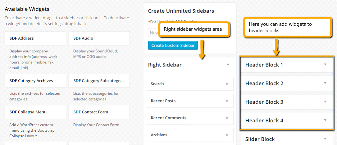
Step 14. How to add widgets to header blocks and sidebars
Add widgets to left, right, above content, below content, header blocks, footer or unlimited sidebars using the SDF widgets section under Appearance Widgets.
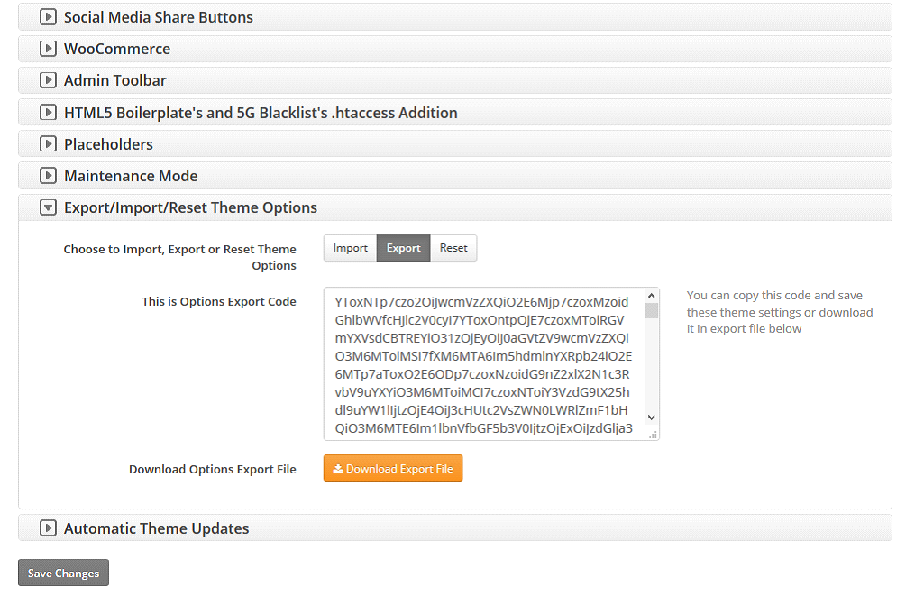
Once you’ve completed your theme customizations, then you can Save Your Settings/Skin under SEO Design > Global Settings > Import/Export Reset Theme Options Chevron > and Click the Export Theme Button.
And that’s it. Now you can use the exported notepad file to add your SDF Skin to any SEO Design Framework installation.